To create this visualization, our Data Visualization Lab took a deep-dive into the open data of the National Data Warehouse for Traffic Information (NDW).
With this visualization, we aim to give you a clear idea what the impact is on traffic flows on the highways in the Netherlands:
Visualizing traffic intensity in the Netherlands for 3 Tuesdays: one before, during, and after intelligent lockdown measures were loosened.
Watch this video externally on:
Vimeo
For this data visualization, our Data Visualization Engineer, Erik Boertjes, took a deep-dive into the data of the National Data Warehouse for Traffic Information (NDW). Based on the NDWs open data, he compared 3 Tuesdays; one dated before, during and exactly one day after the measures were loosened by the Dutch government. With this visualization, we aim to give you a clear idea what the impact is on traffic flows on the highways in the Netherlands.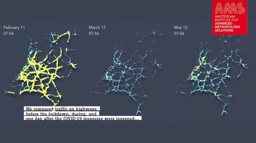
Here, each ball represents a sensor, and the color indicates how many cars per hour have passed these sensors on the highway. Dark blue indicates low traffic intensity, whereas yellow means the roads are busy. Because there are many sensors close to each other, and having all those dots together, the visualization resembles a caterpillar.”
Erik Boertjes
Data Visualization Engineer