Data visualizations NS - Disruptions and Network Coverage
Part of
Keywords
MADE Student Project
Rail transport is essential to lower the number of emissions caused by cars. The increase in the number of train commuters in the last few years increases the pressure on the rail network. The operators of the services have to adapt and become more efficient to avoid delays and crowded trains.
In 2021, 5,6% of the trains in the Netherlands had more than 15 minutes of delay or were cancelled. This might seem like a low percentage but, considering a volume of 1.1 million commuters daily, it means an average of 56000 delayed passengers every day.
With thousands of disruption reports per year, it’s a challenging task for the NS and its associates to handle the information and direct the investments on maintenance to the areas that need it the most. That’s why visualising and summarising the data can be useful in decision-making.
The first graphics show details about the cause and time of disruptions. The last visualization explores the strategy used by the NS to distribute stations and serve as much population as possible.
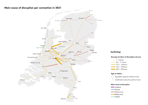
Main cause of disruption per connection in 2021
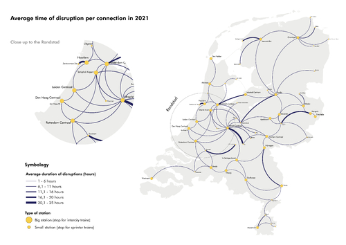
Average time of disuption per connection in 2021
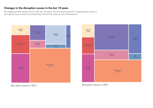
Changes in the disruption causes in the last 10 years
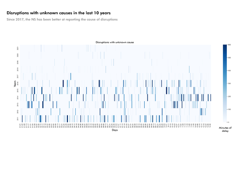
Disruptions with unknown causes in the last 10 years
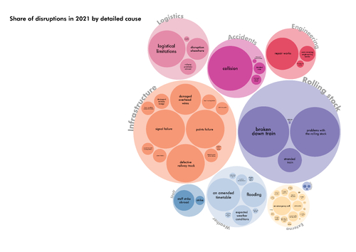
Share of disruptions in 2021 by detailed cause
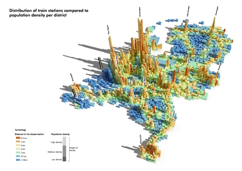
Distributions of train stations compared to population density per district
The dataset about disruptions in rail services in the Netherlands between 2011 and 2021 was found on the website of Rijden de Treinen, which collects information published by the NS. The graphs were made using Python, GIS and Blender.
Author: Matias Cardoso
Image credits
Icon image: IMG6.jpg