Step 5: Data Collection, Processing, Visualisation
Part of
Keywords
Now that you have implemented your Crowd Monitoring project its time to collect the data you need to inform better policy, interventions, and designs to improve your public space. Understanding different types of data sensors can generate and how it is used to achieve your goals in responsible and ethical ways will be the focus of this section.
5.1 Questions
In section 3 we provided vital information about data and GDPR compliance as well as data ethics in relation to crowd monitoring in public spaces. This section is about the data itself – how it is generated, the levels of invasiveness, examples of data architecture, and the value you can generate with visualizations and dashboards. Among some considerations in this section you should think about:
- How invasive is the technology I am using and do I really need to use this technology?
- How can I create a baseline so I can measure the changes I am hoping to make?
- Am I gathering only the data I need to solve my problem or more than I need? If so why?
- How can I minimize the amount of data I am collecting in public space?
- Can we implement a crowd monitoring test, project, or solution that is transparent and inclusive rather than exclusively imposing surveillance?
- Are the right security measures being taken to protect the data from unauthorized access?
- Can the municipality act upon the data I am creating in public spaces?
5.2 Resource Library
The choice of devices and sensors to use is important, especially in public space. There are many different makes and models to choose from. Each of these devices can capture, store, process, and publish data. The devices you decide to use and the data they produce should be proportional to their invasiveness. Below you will find a list of various technologies and types of data they can collect.
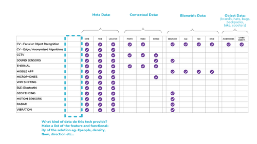
5.2.1 Invasiveness Matrix
A quick guide to the various kinds of data that different crowd monitoring technologies generate. The Invasiveness Matrix will tell you what solutions will create biometric data versus anonymous data, location data and more.
5.2.2 Types of Sensors and Visualisations
Different types of sensors collect different types of data. You will want to understand these differences so you can better understand how to process that data so you can achieve your goals. Without going into too much technical detail, we have written up some basics about three types of sensors that provide valuable data driven insights more than just object detection. For an overview of the full range of sensors you can revisit section 3.2 Technical Resources.
3D Sensor
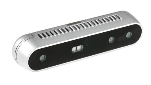
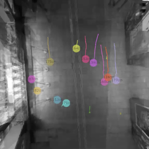
A depth sensing technology that uses three different techniques to detect and image map objects: stereoscopic vision, structured light pattern, or time of flight (ToF). All capture or produce 3-D images which are anonymous and trackable in crowded spaces with a high level of accuracy. In the data visualisation, we can monitor anonymous objects (people) that can be given colors, shapes and ID’s.
IP Cameras & Computer Vision
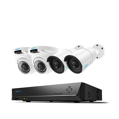
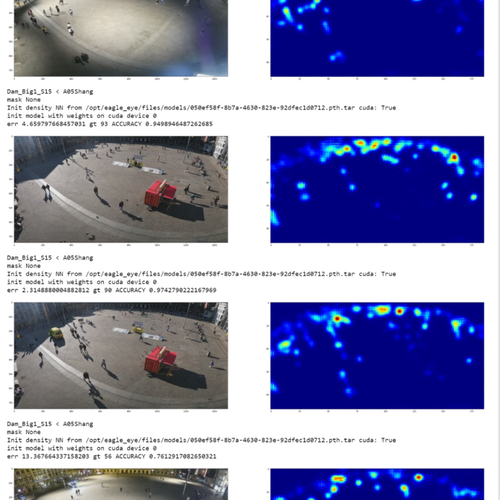
When they’re trained on enough samples, current computer vision systems do a good job at classifying images and localizing objects in photos from video footage but it takes a lot of work to achieve a high level of accuracy. Computer vision applications include facial and object recognition, also biometrics which can be very invasive. In the Amsterdam example, here we are visualising density as an object cluster to help developers and teams to quickly validate the accuracy of their prediction model.
Sound Sensors & Pattern Recognition
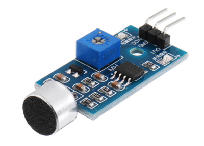
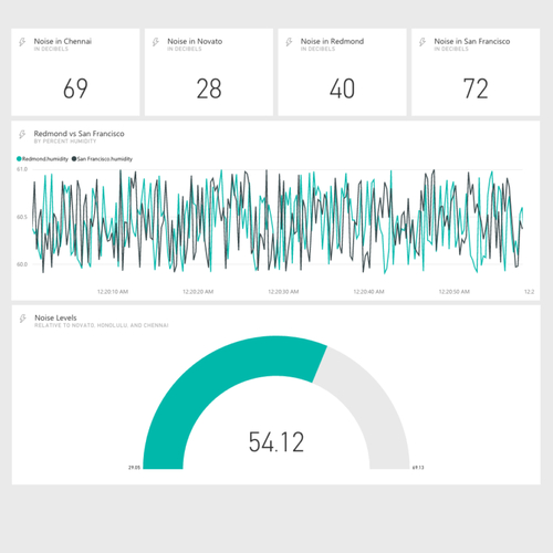
These can be highly accurate and measure volume (dbl), tone, pitch, and/or frequency, or simply detect the existence sound above a certain threshold. They all use microphones but not all deliver insights related to the nature of sound or sound identification which is enabled by using existing libraries or training with machine learning. Typically noise levels are recorded in public spaces and visualised with a graph in a dashboard.
For more information about all the different sorts of sensors being used in several projects in Amsterdam to create data visualisations, download the Crowd Monitoring Systems Amsterdam (CMSA) project report PDF (link)
5.2.3 Data Processing
When you are sensing the city, you want to do it responsibly. You want to make sure that your devices are collecting data accurately and safely. You will need to use ISO standards (link?) and make sure you are GDPR compliant. Why you are gathering data in public spaces and what you are doing with it is more than collecting, processing, and storing but also visualising and sharing so it will be used to inform decisions and to create impact for the public good.
5.2.4 Data Architecture
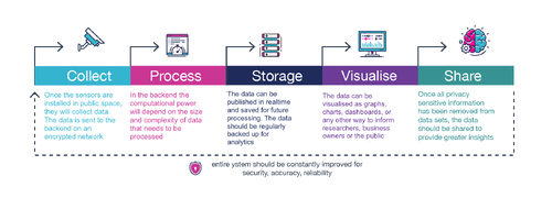
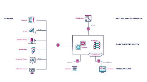
The schematic below provides a basic data architecture based on sensing to provide an overview of the different components and how they work together. The sensors that collect the data send it to a back-end where it is processed, stored and then parsed to different front-ends where they can be visualised and shared in this simple example.
5.2.5 Data Visualisation
Perhaps the most significant way to create impact with the data you are collecting in public spaces is to use visualisations to tell the story of that data and give it meaning so it can be used to improve your city. You want the stakeholders to gain valuable insights that will inform better decisions and designs, but you also want the public to be able to see what their data means and understand how it is being used to their benefit. Below are some examples.
Smart Signs
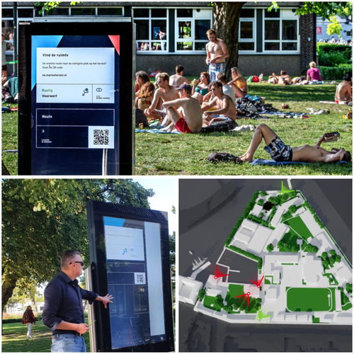
A public information kiosk can use real-time data on 3-D maps or display a simple traffic light design that indicates crowd density so people can make informed decisions in a busy park for instance. This specific example is being tested in Amsterdam at the Marineterrein Living Lab for more information: https://www.living-lab.nl/projects/open-source-crowd-monitor
Dashboards
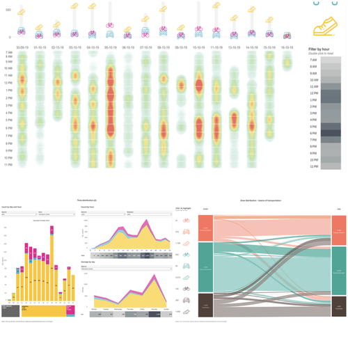
There are many different data visualisation tools like R, Tableau, or Grafana that can visualise data sets. You will need to work with data scientists as well as user interface designers to help tell the story of the data and make it clear how it can help make informed decisions. Here is an example of an interactive crowd monitoring dashboard in Amsterdam. https://www.mt-dashboard.nl
Density Maps
Also known as heat maps, this example looks like a thermal display but is actually detecting clusters of objects in a specific space. In this example the objects are people and the algorithm is created to count people and measure their proximity – the warmer the color the higher the density. This helps event organizers and police see concentrations of activity on a map and identify the location of potential “hotspots.”
For more information about all the different sorts of sensors and projects being used to create data visualizations in Amsterdam download the Crowd Monitoring Systems Amsterdam (CMSA) project report PDF
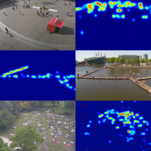
Image credits
Icon image: Blauw
